

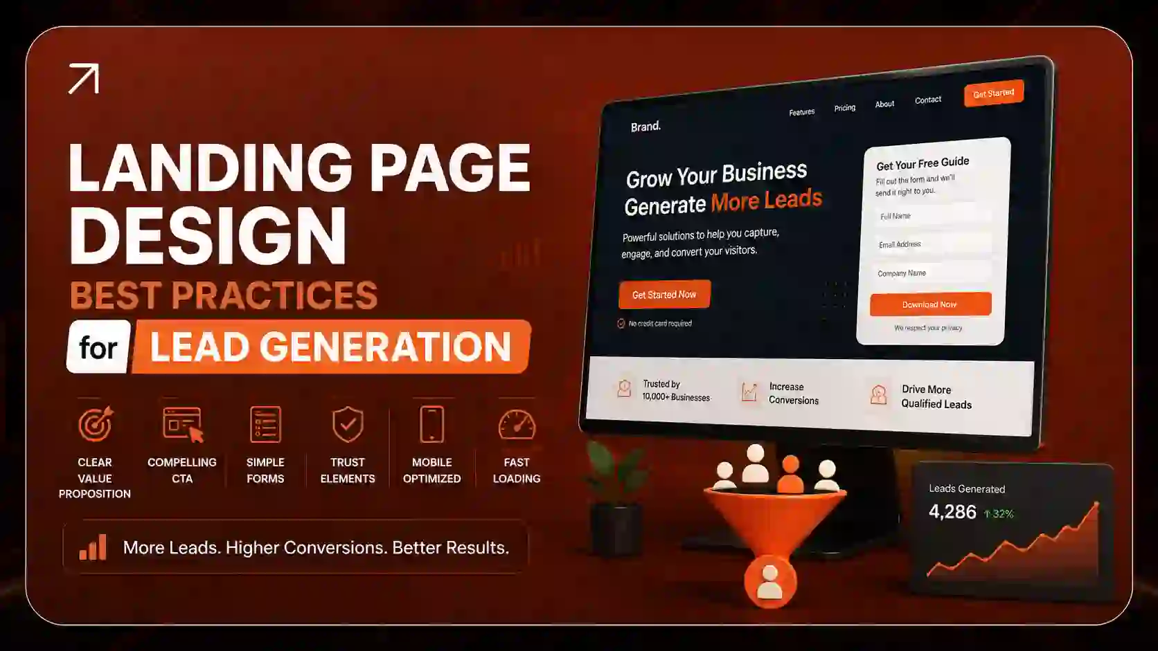
Landing Page Design Best Practices for Lead Generation: The Complete 2026 Guide
Most landing pages don’t fail because of bad traffic. They fail because the page confuses people, asks too much, or gives them no reason to trust the business behind it.
A good lead generation landing page does one job: it turns a curious visitor into a qualified lead. Every headline, image, form field, and button either helps that job or gets in the way.
This guide covers the landing page design best practices that consistently lift conversions for B2B and local service businesses in the U.S. You’ll learn how to structure a high-converting landing page, how many form fields to use, where to place social proof, how to match your ads to your page, and how to test what works. Whether you run PPC campaigns in Orlando or sell SaaS in New York, these principles apply.
What Is a Landing Page in Lead Generation?
A lead generation landing page is a standalone web page built for one goal: capturing a visitor’s contact details in exchange for something of value. That value might be a free consultation, a quote, an ebook, a webinar seat, or a demo.
Unlike a homepage, a landing page has no competing links, menus, or distractions. It exists to move one type of visitor toward one action.
Common types of lead capture pages include:
- Squeeze pages: short pages with a single opt-in form, usually for a lead magnet
- PPC landing pages: built to match a specific Google Ads or Meta Ads campaign
- Consultation or quote pages: designed for high-intent service buyers
- Webinar and event registration pages: focused on sign-ups with a date and time
- SEO landing pages: built to rank organically for a specific search intent
If you’re still getting clear on how lead capture fits into your wider funnel, our breakdown of demand generation vs. lead generation explains where landing pages sit in the customer journey.
Landing Page vs. Website Homepage
This is one of the most common questions we hear, and the difference matters for conversion rate optimization (CRO).
| Factor | Landing Page | Homepage |
|---|---|---|
| Goal | One conversion action | Many goals (explore, learn, navigate) |
| Navigation | Removed or minimal | Full menu |
| Audience | One segment or campaign | Everyone |
| Copy | Focused on one offer | Broad brand overview |
| Typical conversion rate | Higher | Lower |
Short answer: A homepage introduces your business. A landing page asks for one specific action. Sending paid traffic to your homepage almost always wastes budget.
Why Landing Page Design Matters for Lead Generation
You can buy clicks. You can’t buy a page that converts them. Design is the difference between paying $80 per lead and paying $30 for the same lead.
Here’s why landing page design deserves serious attention:
- It multiplies your ad spend. Doubling your conversion rate cuts your cost per lead in half without spending one more dollar on ads.
- It affects your Quality Score. Google evaluates landing page experience as part of how it ranks and prices your ads. A relevant, fast, easy-to-use page can lower your cost per click.
- It filters lead quality. Smart design doesn’t just get more leads. It gets better ones by setting clear expectations before someone submits a form.
- It reduces bounce rate. Visitors decide within seconds whether to stay. A clear hero section keeps them reading.
- It builds trust fast. Most visitors have never heard of you. Trust signals do the job a salesperson would normally do in person.
According to Unbounce’s Conversion Benchmark Report, median landing page conversion rates vary widely by industry, which is exactly why design and message fit matter more than generic benchmarks.
The Anatomy of a High-Converting Landing Page
Every high-converting lead generation landing page includes these core elements:
- A clear, outcome-focused headline
- A supporting subheadline that explains how
- A strong value proposition
- A relevant hero image or short video
- A short, low-friction lead capture form
- One primary call to action (CTA)
- Social proof and trust signals
- Benefit-driven body copy
- Objection-handling (FAQs or guarantees)
- A repeat CTA near the bottom
Think of these as your landing page design checklist. Now let’s walk through each pillar in detail.
Pillar 1: Hero Section and Value Proposition
The hero section is the part of the page visitors see before scrolling. It carries more weight than anything else on the page.
The 3-Second Rule for Above-the-Fold Design
A visitor should understand three things within about three seconds:
- What you offer
- Who it’s for
- What to do next
If your above-the-fold area can’t answer those questions at a glance, people leave. Research from the Nielsen Norman Group shows that people scan web pages rather than read them word by word, so the top of the page must communicate instantly.
How to Write a High-Converting Headline
Your headline should promise an outcome, not describe a service.
Weak: “Professional HVAC Services”
Strong: “Get Your AC Fixed Today, or the Service Call Is Free”
Weak: “B2B Marketing Solutions”
Strong: “Book 20+ Qualified Sales Meetings Every Month”
Proven headline formulas that work for lead generation:
- Outcome + timeframe: “Get More Qualified Leads in 30 Days”
- Problem + solution: “Tired of Leads That Never Answer? Get Sales-Ready Prospects”
- Specific number: “Join 2,000+ Florida Homeowners Who Cut Energy Bills”
- Question: “Is Your Website Costing You Customers?”
Hero Section Best Practices
- Keep the headline under 12 words where possible
- Use a subheadline to explain how you deliver the promise
- Show the form or CTA button above the fold on desktop
- Use real photos of your team, product, or results instead of generic stock images
- Use whitespace generously so the headline and CTA stand out
Pillar 2: Form Design and Friction Reduction
The form is where leads are won or lost. Every extra field adds friction. Every confusing label adds doubt.
How Many Form Fields Should a Landing Page Have?
Use as few fields as you need to qualify the lead. For top-of-funnel offers like ebooks or newsletters, one to three fields (name and email) usually work best. For high-intent B2B sales leads, four to five fields, or a multi-step form, balance conversion volume with lead quality.
A simple rule we follow: if your sales team never uses a field, delete it.
| Offer Type | Recommended Fields |
|---|---|
| Newsletter / checklist | Email only, or name + email |
| Ebook / whitepaper | Name, email, company |
| Webinar | Name, email, job title |
| Free consultation | Name, email, phone, company, need |
| B2B demo request | Multi-step form with qualifying questions |
If you’re unsure which fields qualify a lead properly, frameworks like BANT and MEDDIC help. Our guide on how to qualify B2B leads shows which questions actually predict a sale.
Multi-Step Form vs. Single-Step Form
Multi-step forms often outperform long single-step forms because of a simple psychological effect: once someone answers an easy first question, they’re more likely to finish.
Use a single-step form when:
- You need three fields or fewer
- The offer is low commitment
Use a multi-step form when:
- You need five or more fields
- You want to qualify leads (budget, timeline, company size)
- Your offer is a quote, consultation, or demo
Tip: Start a multi-step form with the easiest, least personal question (“What service do you need?”) and ask for contact details last.
Form Design Best Practices
- Label every field clearly above the input, not only as placeholder text
- Use smart defaults and dropdowns where possible
- Show inline validation so errors appear as users type, not after they submit
- Mark optional fields instead of required ones
- Add a privacy note under the form (“We never share your information”)
- Use micro-interactions like a progress bar or checkmark to make completion feel rewarding
The Baymard Institute has published extensive usability research on form design, and its findings consistently show that confusing fields and poor error messages drive abandonment.
Pillar 3: Call to Action (CTA) Best Practices
Your CTA is the moment of decision. It deserves more thought than most businesses give it.
How Many CTAs Should a Landing Page Have?
A landing page should have one primary conversion goal. You can repeat the same CTA several times on a long page, but you shouldn’t offer competing actions like “Download the guide” and “Book a call” with equal weight.
How to Write CTA Copy That Converts
Replace generic verbs with value-driven, first-person language.
| Generic CTA | Better CTA |
|---|---|
| Submit | Get My Free Quote |
| Sign Up | Send Me the Checklist |
| Learn More | Show Me How It Works |
| Contact Us | Book My Free Strategy Call |
CTA Design Tips
- Use a contrasting color that appears nowhere else on the page
- Make the button large enough to tap easily on mobile
- Add a micro-copy line below it (“No credit card required” or “Takes 30 seconds”)
- Place a trust badge or security seal near the submit button to reduce hesitation
- Repeat the CTA after major content sections on long pages
Pillar 4: Trust Signals and Social Proof
People don’t hand their details to strangers. Social proof is how you stop being a stranger.
Types of Trust Signals That Work
- Client logos from recognizable brands
- Testimonials with full names, photos, and job titles
- Specific results (“Increased demo bookings by 47% in 90 days”)
- Star ratings and review counts from Google or industry platforms
- Certifications and partner badges (Google Partner, HubSpot, industry associations)
- Security seals near forms
- Press mentions (“As featured in…”)
- Guarantees that remove risk
Where to Place Social Proof on a Landing Page
- Directly under the hero section: a strip of client logos
- Next to the form: one short, specific testimonial
- Mid-page: a case study or results section
- Before the final CTA: a strong testimonial or guarantee
Video Testimonials vs. Text Testimonials
Video testimonials tend to feel more authentic because they’re harder to fake. Text testimonials are faster to scan. The best approach combines both: short text quotes throughout the page and one video testimonial in a results section.
For B2B landing pages, specific numbers beat vague praise every time. “Great team, would recommend” builds little trust. “Our cost per lead dropped from $140 to $62” builds a lot.
Pillar 5: Message Match and Ad Intent
Message match is one of the most overlooked landing page optimization tactics, especially for PPC.
What Is Message Match?
Message match means your landing page repeats the headline, offer, and key phrases from the ad that brought the visitor there. It confirms that they’ve landed in the right place, which lowers bounce rate and raises conversions.
Example:
- Ad: “Orlando Roof Repair – Free Inspection in 24 Hours”
- Poor landing page headline: “Welcome to ABC Roofing”
- Strong landing page headline: “Free 24-Hour Roof Inspection in Orlando”
PPC Landing Page Design Best Practices
- Build one landing page per ad group or offer, not one page for everything
- Include the target keyword in the headline naturally
- Match the imagery and tone of your ad creative
- Follow Google Ads destination requirements so your ads don’t get disapproved
- Use dynamic text replacement to personalize headlines by keyword or location
Personalized landing pages, such as versions tailored to a city, industry, or job role, often convert better because they feel written for that visitor. If you’re running paid search for B2B, our guide to Google Ads for B2B covers campaign structure that pairs well with dedicated landing pages. And if you’re deciding where to invest first, see our SEO vs. PPC ROI comparison.
Pillar 6: Technical Speed and Mobile UX
A beautiful page that loads slowly converts poorly. Speed and mobile usability are conversion factors, not just technical details.
Page Load Speed and Lead Generation Conversion
Research from Think with Google found that as mobile page load time goes from one second to three seconds, the probability of a bounce increases by 32%. Every second counts, especially on paid traffic.
Core Web Vitals and Landing Page CRO
Google’s Core Web Vitals measure real user experience. For a good experience, aim for:
- Largest Contentful Paint (LCP): 2.5 seconds or less
- Interaction to Next Paint (INP): 200 milliseconds or less
- Cumulative Layout Shift (CLS): 0.1 or less
Layout shift is a silent conversion killer. When a button jumps just as someone taps it, they either click the wrong thing or give up. Our Core Web Vitals guide explains how to fix each metric, and you can test your page anytime with PageSpeed Insights.
Page Speed Optimization Checklist
- Compress images and use modern formats like WebP or AVIF
- Remove unused scripts, plugins, and tracking tags
- Lazy-load images below the fold
- Use a content delivery network (CDN)
- Reserve space for images and embeds to prevent layout shifts
- Limit custom fonts to one or two families
For a deeper technical walkthrough, read our developer guide to speeding up a slow website.
Mobile-First Lead Capture Design
Much of your paid social and search traffic will arrive on a phone. Design for that screen first.
- Use a single-column layout
- Add a sticky mobile CTA button that stays visible while scrolling
- Use large tap targets and readable font sizes (16px minimum for body text)
- Use the right keyboard types (numeric for phone fields, email keyboard for email fields)
- Enable click-to-call for service businesses
- Keep forms short, since typing on mobile is slow
Our article on mobile-first web development covers responsive design principles in more detail.
Accessibility Is a Conversion Factor
Accessible pages convert more people because more people can use them. Follow the WCAG guidelines: use strong color contrast, label all form fields, write descriptive alt text, and make sure the page works with a keyboard alone.
Should a Landing Page Have a Navigation Menu?
In most cases, no. Navigation menus give visitors exits that pull them away from your conversion goal. Removing the main navigation keeps attention on the offer.
Keep only:
- Your logo (optionally unlinked)
- A phone number, if calls are a conversion goal
- Footer links required for legal compliance, such as your privacy policy
How Long Should a Landing Page Be?
Landing page length should match the commitment you’re asking for. Low-commitment offers need short pages. High-commitment offers need longer pages that answer objections.
| Short-Form Landing Page | Long-Form Landing Page |
|---|---|
| Free checklist, newsletter, webinar | Consultation, demo, high-ticket service |
| Warm or retargeted traffic | Cold traffic |
| Simple, familiar offer | Complex or expensive offer |
| One screen to a few sections | Multiple sections with FAQs and case studies |
When in doubt, test both.
Landing Page Copywriting Tips
Design gets attention. Copy gets the conversion.
- Write for one reader. Use “you” more than “we.”
- Lead with benefits, back them with features. “Get leads while you sleep” first, “24/7 automated follow-up” second.
- Be specific. “Save 6 hours a week” beats “save time.”
- Use short sentences and short paragraphs.
- Answer objections before they’re asked: price, time, risk, and trust.
- Use scarcity and urgency honestly. A real deadline works. A fake countdown timer damages trust.
Your landing page copy should sound like a helpful expert talking to one person, not a brochure talking to a crowd.
Landing Page A/B Testing: How to Test Effectively
Best practices give you a strong starting point. Testing tells you what works for your audience.
How to A/B Test a Landing Page Effectively
- Start with data. Use Google Analytics, heatmap analysis, and session recordings to find where people drop off.
- Form a clear hypothesis. “Reducing the form from six fields to four will increase submissions because the phone field causes hesitation.”
- Test one major change at a time. Headline, form length, CTA copy, or hero image.
- Let the test run long enough. Wait for statistical significance and at least one to two full business cycles.
- Measure lead quality, not just volume. A variant that doubles leads but halves sales-qualified leads isn’t a win.
- Document every result so your team builds on what it learns.
What to Test First (Highest Impact)
- Headline and value proposition
- Form length and structure
- CTA copy and placement
- Offer type (lead magnet vs. direct consultation)
- Social proof placement
- Hero image vs. video
Use Google Tag Manager to track form submissions, button clicks, and scroll depth accurately. Without clean tracking, your tests are guesswork.
Landing Page Design Mistakes to Avoid
If your landing page isn’t converting, check for these common problems:
- Unclear headline that doesn’t state a benefit
- Multiple competing CTAs
- Full navigation menu leaking traffic
- Too many form fields for a low-value offer
- No social proof or only vague testimonials
- Slow load time, especially on mobile
- Message mismatch between the ad and the page
- Generic stock photos that feel impersonal
- Walls of text with no visual hierarchy
- No thank-you page or follow-up after submission
Why Is My Landing Page Not Converting?
Most landing pages fail to convert because of one of five issues: the wrong traffic, a weak offer, an unclear message, too much friction, or a lack of trust.
Diagnose it in this order:
- Traffic: Are you targeting people with real intent?
- Offer: Is what you’re giving worth their contact details?
- Message: Does the headline match the ad and the visitor’s need?
- Friction: Is the form short and the page fast?
- Trust: Do visitors have reasons to believe you?
For a broader look at conversion fundamentals, see our guide on how to increase website conversion rate, and benchmark your numbers with our B2B lead conversion rate guide.
Landing Page Design for B2B Lead Generation
B2B landing pages face longer sales cycles, multiple decision-makers, and higher skepticism. Adjust your design accordingly:
- Offer a lead magnet that fits the buying stage: industry reports and calculators for early stages, demos and audits for late stages
- Show ROI clearly with case studies and numbers
- Use qualifying form fields such as company size and role
- Add security and compliance badges (SOC 2, GDPR, HIPAA where relevant)
- Connect to your CRM so sales can follow up within minutes
Speed of follow-up matters as much as the page itself. A lead contacted within the first hour is far more likely to convert than one contacted the next day. Pair your landing pages with B2B appointment setting or telemarketing and sales support to close that gap. For a wider view, our B2B website design for lead generation guide and B2B lead generation strategies for 2026 show how landing pages fit into the full system.
Landing Page Design for Small Businesses
Small businesses don’t need complex funnels. They need clarity.
- Lead with your location and service (“Emergency Plumber in Orlando”)
- Show real photos of your team and work
- Display Google reviews prominently
- Make click-to-call the main mobile CTA
- Offer a simple incentive: free estimate, same-day service, or a discount
Tools and Software for Building Landing Pages
What software is best for building landing pages? The best choice depends on your team’s skills and how much control you need.
| Tool | Best For | Strengths |
|---|---|---|
| Unbounce | PPC marketers | A/B testing, dynamic text replacement |
| Instapage | Agencies and ad-heavy teams | Personalization, collaboration |
| Leadpages | Small businesses | Affordable, simple templates |
| HubSpot landing pages | Inbound marketing teams | Built-in CRM and email |
| Webflow / Framer | Design-focused teams | Visual control, clean code |
| Custom-coded pages | Performance-critical campaigns | Maximum speed and flexibility |
Custom-Coded Landing Page vs. Unbounce, Webflow, or Framer
Builders are fast to launch and easy to test. Custom-coded pages load faster, integrate more deeply with your systems, and aren’t limited by templates. Many growing businesses start with a builder and move to custom development once they know what converts. Our comparison of Webflow vs. WordPress vs. custom builds walks through the tradeoffs.
For tracking and analysis, the essentials are Google Analytics, Google Tag Manager, a heatmap tool, and your CRM. We’ve reviewed more options in our list of the best B2B lead generation tools.
How to Design a Landing Page From Scratch: Step-by-Step
- Define one goal and one audience. Who is this page for, and what should they do?
- Choose your offer. Lead magnet, consultation, quote, or demo.
- Research your visitor’s language. Use search queries, reviews, and sales calls. Our guide to keyword research for leads helps here.
- Write the copy before designing. Headline, value proposition, benefits, proof, FAQs.
- Wireframe the layout. Hero, proof, benefits, form, FAQs, final CTA.
- Design with visual hierarchy. Size, contrast, and whitespace guide the eye to the CTA.
- Build mobile-first and optimize speed.
- Set up tracking. Conversion events, UTM parameters, CRM integration.
- Launch, measure, and A/B test.
- Refine monthly based on data and lead quality feedback.
Landing Page Design Trends for 2026
- AI-powered personalization: headlines and offers adapted by industry, location, or referral source
- Interactive lead magnets: calculators, quizzes, and assessments that qualify while they engage
- Conversational forms: one question at a time, chat-style
- Short-form video in hero sections: quick explainers and founder messages
- Answer-first content: clear, direct answers that perform well in AI Overviews and answer engines
- Privacy-first data capture: clearer consent and first-party data strategies
On the SEO side, structured data helps search engines understand your page. Note that Google now shows FAQ rich results mainly for well-known, authoritative government and health sites, so treat FAQ schema as a clarity aid rather than a guaranteed SERP feature. Clear, direct answers still help your content get cited in AI-powered search. Our on-page SEO services cover schema markup and content structure.
Real-World Landing Page Examples (What Works and Why)
Example 1: Local HVAC company, Orlando
A heating and cooling company replaced its homepage-as-landing-page setup with a dedicated page per service. Each page matched its ad headline, featured Google reviews next to a three-field form, and added a sticky click-to-call button on mobile. The combination of message match and lower friction is the pattern that typically drives the biggest early gains.
Example 2: B2B SaaS demo page, New York
A software company switched from a nine-field demo form to a three-step form that asked about team size first and contact details last. Sales also received better-qualified leads because qualification happened inside the form.
Example 3: Professional services lead magnet
A consulting firm offered a free industry benchmark report on a short squeeze page with one testimonial, a clear preview image of the report, and a two-field form. Retargeting ads then drove those leads toward a consultation page.
The lesson across all three: the winning pages were simpler, more specific, and more trustworthy than what came before.
Landing Page Design Services in Orlando, New York, and Across the USA
Local buyers search differently. Someone searching “landing page design company Orlando FL” or “landing page design agency NYC” usually wants a partner who understands their market, competitors, and customers.
Orlando and Florida businesses often compete in crowded local service markets such as home services, healthcare, real estate, and hospitality. Location-specific landing pages with local reviews and service-area details win here. Leads 360 LLC offers custom website development in Orlando and across Florida.
New York and Manhattan businesses face high ad costs, so every percentage point of conversion rate matters. Tight message match, fast load times, and strong B2B proof are essential.
National campaigns need scalable templates that can be personalized by city, industry, or offer. Our custom website development services in the USA support multi-location landing page systems for businesses in Los Angeles, Chicago, Dallas, Houston, Atlanta, Miami, and beyond.
How Much Does Landing Page Design Cost?
Landing page design cost depends on complexity, copywriting, integrations, and testing needs. A simple template-based page costs far less than a custom-coded page with CRM integration, personalization, and ongoing A/B testing. The best way to budget is to compare the page’s cost with the value of the extra leads it produces. For wider pricing context, see our web development cost guide for the USA.
How to Learn Landing Page Design (Free and Paid Resources)
If you want to build these skills in-house, here’s where to start:
Free resources
- Google Search Central’s guide to helpful content
- web.dev for performance and Core Web Vitals
- Nielsen Norman Group articles on UX and reading behavior
- The Leads 360 LLC blog for practical lead generation and web development guides
Paid resources
- CRO courses and certifications from established marketing education platforms
- Premium UX research memberships such as Baymard Institute
- Landing page builder academies (Unbounce, HubSpot, Instapage)
Best learning method: build, test, and review real data. Nothing teaches CRO faster than watching your own heatmaps.
Why Choose Leads 360 LLC for Lead Generation Landing Pages
A landing page is only as strong as the strategy, traffic, and follow-up behind it. That’s why businesses choose Leads 360 LLC: we connect all three.
- Strategy first: we define your audience, offer, and conversion goal before design begins
- Conversion-focused design and development: fast, mobile-first pages built by our web development team
- Paid traffic that matches the page: our performance marketing services align ads and landing pages for strong message match
- Organic visibility: our SEO services in the USA help SEO landing pages rank and earn traffic without ad spend
- Lead follow-up: appointment setting and sales support so leads don’t go cold
- Testing and reporting: continuous A/B testing with clear reporting on lead quality, not just volume
Explore advanced services at Leads 360 LLC to see how we build complete lead generation systems.
Frequently Asked Questions
What is a landing page in lead generation?
A lead generation landing page is a standalone page designed to capture a visitor’s contact information in exchange for an offer, such as a free consultation, quote, ebook, or demo. It focuses on one goal and removes distractions like navigation menus.
What makes a landing page effective for lead generation?
An effective lead generation landing page has a single goal, an outcome-focused headline, a clear value proposition, a short form, one strong CTA, visible trust signals, fast load speed, and a mobile-friendly design.
What elements should every landing page have?
Every landing page should include a headline, subheadline, value proposition, relevant visual, lead capture form, primary CTA, social proof, benefit-focused copy, and objection-handling content such as FAQs or guarantees.
How many form fields should a landing page have?
Use one to three fields for low-commitment offers like newsletters or lead magnets. Use four to five fields, or a multi-step form, for high-intent B2B leads where qualification matters.
How many CTAs should a landing page have?
A landing page should have one primary call to action. You can repeat that same CTA several times on a longer page, but avoid offering competing actions.
What is a good conversion rate for a landing page?
Conversion rates vary by industry, offer, and traffic source. Many landing pages convert in the single digits, while well-optimized lead generation pages with strong ad relevance can reach double-digit conversion rates.
Should a landing page have navigation menus?
No. Removing navigation menus keeps visitors focused on the conversion goal. Keep only your logo, an optional phone number, and required legal links.
How long should a landing page be?
Match length to commitment. Short pages suit low-commitment offers and warm traffic. Longer pages suit high-value services, cold traffic, and complex offers that need more explanation.
What is the difference between a landing page and a homepage?
A homepage introduces your whole business and offers many paths. A landing page focuses on one offer, one audience, and one action, which makes it better for converting paid and campaign traffic.
Why is my landing page not converting?
Common causes include poorly targeted traffic, a weak offer, a headline that doesn’t match the ad, too many form fields, slow load times, and a lack of trust signals. Fix them in that order.
Final Landing Page Design Checklist
Before you launch, confirm:
- [ ] One clear goal and one primary CTA
- [ ] Headline matches the ad or search intent
- [ ] Value proposition is visible above the fold
- [ ] Navigation menu removed
- [ ] Form uses only necessary fields
- [ ] Social proof near the form and CTA
- [ ] Page loads fast and passes Core Web Vitals
- [ ] Mobile layout is single-column with a sticky CTA
- [ ] Accessibility basics covered (contrast, labels, alt text)
- [ ] Conversion tracking set up in Google Analytics and Google Tag Manager
- [ ] Thank-you page and follow-up process ready
- [ ] A/B test planned
Conclusion: Turn More Visitors Into Qualified Leads
Great landing page design isn’t about flashy visuals. It’s about clarity, trust, and removing friction at every step. Start with one goal. Match your message to your traffic. Keep your form short. Prove your claims. Make the page fast on every device. Then test, learn, and improve.
When these landing page design best practices work together, you don’t just get more leads. You get better leads at a lower cost.
Ready to build landing pages that actually convert? Book a seat at the Advanced Services offered by Leads 360 LLC and let our team design, launch, and optimize a lead generation system built around your business.